What FlexControls do?
FlexControls brings a piece of XAML and UWP design language features that help you to save time and de-couple your CSS code. You don’t need to create an extra CSS file and classes for each page, just add new control instead of HTML element and set the desired properties. To start, we recommend you to draw a layout of your page on paper or a whiteboard and divide it into horizontal and vertical sections.
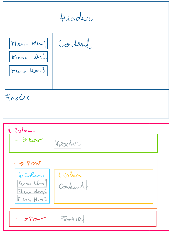
If you’re done, you’re ready to start implementing your page layout. It’s all done by combining Wrapper and Element controls, which differs in the number of properties. While Wrapper control displays its children in CSS flexbox and contains more properties like orientation, content alignment, spacing, etc., Element control cares about its position and other settings in Wrapper control.
<flex:Wrapper Orientation="Column"
              Size="1">

    <!-- Header -->
    <flex:Wrapper Orientation="Row"
                  Size="20%"
                  WrapperTagName="Header"
                  HorizontalContentAlignment="Center" VerticalContentAlignment="Center">
        <p>Header</p>
    </flex:Wrapper>

    <!-- Main -->
    <flex:Wrapper Orientation="Row"
                  Size="1"
                  WrapperTagName="Main">

        <!-- Menu -->
        <flex:Wrapper Orientation="Column"
                      Size="200px"
                      HorizontalSpacing="2" VerticalSpacing="2"
                      RenderWrapperTag="false">
            <dot:Repeater DataSource="{controlProperty: MenuItems}"
                          WrapperTagName="Nav">
                <flex:Element RenderWrapperTag="false">
                    <p>Menu Item {{value: _this}}</p>
                </flex:Element>
            </dot:Repeater>
        </flex:Wrapper>

        <!-- Content -->
        <flex:Element Size="1">
            <p>Content</p>
        </flex:Element>

    </flex:Wrapper>

    <!-- Footer -->
    <flex:Wrapper Orientation="Row"
                  Size="20%"
                  WrapperTagName="Footer">
        <p>Footer</p>
    </flex:Wrapper>

</flex:Wrapper>

Style and Value resources
Moreover, you can share any values and base styles, which can be bound to controls through resource bindings, as well as you can create the most common layouts as master pages. All those little features can help you to unify the layout language among programmers and rip off the page-specific styles from the rest of your CSS code.
public static class Variables
{
    public static readonly int SpacingDefault = 1;
    public static readonly string SizeMenu = "200px";
    public static readonly string SizeContent = "1";
}

public static class Styles
{
    public static readonly IWrapperStyle MyWrapperStyle = new WrapperStyle()
    {
        Orientation = Orientation.Column,
        Size = "1",
        HorizontalContentAlignment = ContentAlignment.Center,
        VerticalContentAlignment = ContentAlignment.Center
    };
}
<flex:Wrapper Orientation="Row">

    <flex:Wrapper BaseStyle="{resource: Styles.MyWrapperStyle}"
                  Size="{resource: Variables.SizeMenu}">
        <p>Menu</p>
    </flex:Wrapper>

    <flex:Wrapper BaseStyle="{resource: Styles.MyWrapperStyle}"
                  Size="{resource: Variables.SizeContent}">
        <p>Content</p>
    </flex:Wrapper>

</flex:Wrapper>
Responsivity
Another cool feature that was inspired by UWP is a collection of triggers used to make pages responsive to different sizes of screen. Imagine the previous scenario with a side menu on a mobile device. It is obvious that the page needs to change a little. To be more specific, it would be great to change the orientation of the Wrapper control for menu and content. All we need is to add a collection named Triggers and change the orientation property of a mobile trigger.
<Triggers>
    <flex:MobileWrapper Orientation="Column" />
    <flex:TabletWrapper Orientation="Column" />
</Triggers>
How it works?
Maybe you ask how this could work with custom values. A small number of values for different properties like size, spacing and order are pre-generated, and when it’s not, FlexControls generates custom CSS code into a page’s style attribute. This style is connected to control with a unique CSS class name.
<div class="dotvvm-flex dotvvm-flex-direction-column dotvvm-flex-size-1x">
    <!-- Header -->
    <header class="dotvvm-flex-78f8c0b6-e3b0-4854-89c6-434028af86ca dotvvm-flex dotvvm-flex-direction-row dotvvm-flex-horizontal-content-alignment-center dotvvm-flex-vertical-content-alignment-center">
        <p>Header</p>
    </header>
    <style>.dotvvm-flex-78f8c0b6-e3b0-4854-89c6-434028af86ca{flex:0 0 20%}</style>
    <!-- Main -->
    <main class="dotvvm-flex dotvvm-flex-direction-row dotvvm-flex-size-1x">
        <!-- Menu -->
        <nav class="dotvvm-flex-c062b01b-5aac-4d74-8b77-3c3159b41bc5 dotvvm-flex dotvvm-flex-direction-column dotvvm-flex-space-horizontal-2x dotvvm-flex-space-vertical-2x">...</nav>
        <style>.dotvvm-flex-c062b01b-5aac-4d74-8b77-3c3159b41bc5{flex:0 0 200px}</style>
        <!-- Content -->
        <div class="dotvvm-flex dotvvm-flex-size-1x">
            <p>Content</p>
        </div>
    </main>
    <!-- Footer -->
    <footer class="dotvvm-flex-a7897af1-f5ff-44c5-94e0-0e1af367388c dotvvm-flex dotvvm-flex-direction-row">
        <p>Footer</p>
    </footer>
    <style>.dotvvm-flex-a7897af1-f5ff-44c5-94e0-0e1af367388c{flex:0 0 20%}</style>
</div>
Conclusion
We believe that Flex Controls can help us do great things and may find its place in large-scale applications or generated applications. It is supposed to unify the design language among programmers, simplify it and speed-up its whole process. Even there is no exact day of publishing, FlexControls are almost ready, and we expect them to be released very soon. Unfortunately, after I have left the company this project was never published.